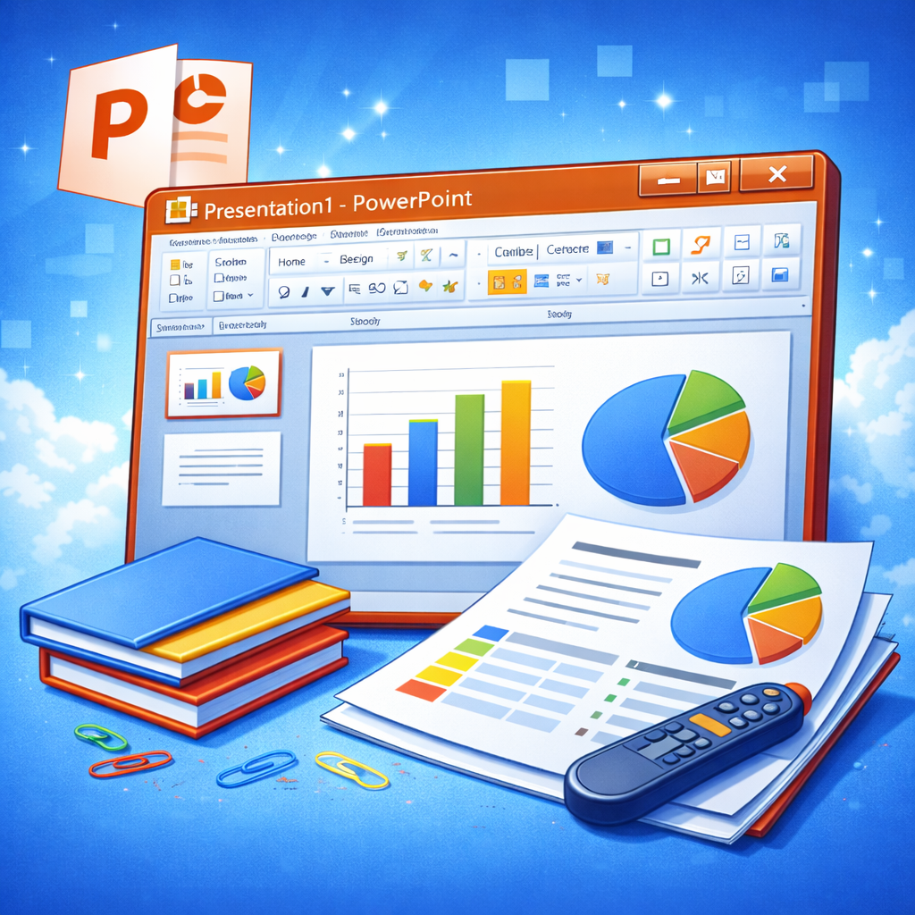
Microsoft PowerPoint
Introduction to Microsoft PowerPoint
Microsoft PowerPoint is more than just a presentation tool—it’s a storytelling platform that has shaped how ideas are shared across classrooms, boardrooms, and conference halls worldwide. Whether you’re pitching a business idea, teaching a lesson, or delivering a keynote speech, PowerPoint has likely played a role in your journey. It’s that familiar canvas where thoughts turn into slides and slides turn into impact.
Think about the last presentation you saw. Chances are, it was built on PowerPoint. Why? Because it’s simple, accessible, and incredibly powerful when used correctly. From sleek corporate decks to creative portfolios, PowerPoint adapts to almost any scenario. It allows users to combine text, images, charts, videos, animations, and data into a cohesive narrative.
But here’s the thing—most people only scratch the surface of what PowerPoint can actually do. They use basic templates, add bullet points, and call it a day. Yet beneath that simple interface lies a robust suite of tools capable of transforming ordinary slides into visually compelling experiences.
In this comprehensive guide, we’ll dive deep into everything you need to know about Microsoft PowerPoint—from its history and core features to advanced tools and expert design strategies. Whether you’re a beginner or someone who wants to level up your presentation game, this guide will walk you through it all in a practical, engaging way.
Let’s explore what makes Microsoft PowerPoint the king of presentation software.
The Evolution of Microsoft PowerPoint
Early Beginnings
Microsoft PowerPoint wasn’t always the polished, feature-rich software we know today. In fact, it started back in 1987 under the name “Presenter,” created by a software company called Forethought, Inc. Shortly after its release, Microsoft acquired the company for $14 million—one of its smartest early investments.
The first versions were designed for Macintosh computers and focused primarily on creating overhead transparencies. Yes, those old-school projector sheets teachers used to place on overhead projectors. It’s almost nostalgic to think about how far we’ve come from those days.
PowerPoint quickly gained popularity because it offered something revolutionary at the time: a visual way to communicate ideas digitally. Instead of handwritten slides or printed posters, presenters could now design structured, professional-looking slides with ease.
Major Updates and Milestones
Over the years, PowerPoint evolved alongside technology. When Windows became dominant, PowerPoint became a central component of the Microsoft Office suite. Major updates introduced:
- Advanced animations and transitions
- SmartArt graphics
- Embedded multimedia
- Cloud-based collaboration
- AI-powered design suggestions through Designer
The introduction of Office 365 (now Microsoft 365) transformed PowerPoint even further. Real-time collaboration, cloud storage via OneDrive, and AI-driven features changed how teams build presentations together.
Today, PowerPoint isn’t just desktop software—it’s available online, on tablets, and on smartphones. It has adapted to modern workflows while maintaining its core identity.
From overhead transparencies to AI-assisted slide design, PowerPoint’s journey reflects the evolution of digital communication itself.
Why Microsoft PowerPoint Still Dominates Presentations
With so many alternatives available—Google Slides, Keynote, Prezi—you might wonder why PowerPoint still leads the market. The answer is simple: versatility and familiarity.
First, PowerPoint is deeply integrated into business ecosystems. Most companies use Microsoft Office, which makes PowerPoint the default presentation tool. Compatibility matters. When you send a PowerPoint file, you know it will open correctly almost anywhere.
Second, it offers unmatched customization. Unlike some web-based tools that limit creative flexibility, PowerPoint allows detailed control over layouts, animations, slide masters, and formatting. You can go minimal—or go cinematic.
Third, it continuously evolves. Microsoft integrates AI features like Design Ideas and Presenter Coach, helping users improve layout and delivery. It’s like having a mini presentation consultant built into the software.
Finally, PowerPoint supports almost every media format imaginable—images, audio, video, 3D models, and interactive elements. That flexibility makes it suitable for:
- Business proposals
- Academic lectures
- Training sessions
- Marketing pitches
- Webinars
- Personal projects
PowerPoint remains dominant because it balances simplicity with depth. Beginners can create slides in minutes, while advanced users can craft visually stunning presentations that feel like professional productions.
In short, PowerPoint works for everyone.
Key Features of Microsoft PowerPoint
Slide Layouts and Templates
One of PowerPoint’s most practical features is its wide range of slide layouts and templates. If you’ve ever felt overwhelmed staring at a blank slide, templates are your best friend. They provide structure, visual consistency, and design inspiration in seconds.
PowerPoint offers built-in themes that include coordinated fonts, colors, and layout styles. Instead of designing from scratch, you can choose a professional template and focus on your message. For businesses, this ensures brand consistency across presentations.
Layouts allow you to quickly insert content placeholders for:
- Titles
- Subtitles
- Bullet points
- Images
- Charts
- Videos
The real magic happens when you customize these layouts using the Slide Master feature. By editing the master slide, you can apply consistent branding, logos, and formatting across your entire deck automatically.
Templates save time. Layouts provide structure. Together, they form the backbone of any strong presentation.
Design Tools and Themes
Let’s be honest—most of us aren’t professional designers. Yet when we open Microsoft PowerPoint, we’re suddenly expected to act like one. That’s where PowerPoint’s design tools and themes quietly save the day.
Themes in PowerPoint are more than just color combinations. They’re complete design systems. Each theme includes coordinated fonts, background styles, color palettes, and layout variations. When you apply a theme, you’re not just changing the look of one slide—you’re transforming the entire visual identity of your presentation. It’s like giving your slides a wardrobe makeover in one click.
What makes themes powerful is consistency. And consistency builds trust. Imagine attending a presentation where every slide uses different fonts, clashing colors, and random layouts. It feels chaotic, right? Themes prevent that. They create visual harmony, making your content easier to follow.
PowerPoint also includes the Designer (Design Ideas) feature, powered by AI. As soon as you insert an image or text, Designer suggests layout improvements. It might reposition elements, adjust spacing, or recommend visual variations. Think of it as a digital assistant whispering, “This would look better over here.”
You can also customize themes to match your brand. Want your company’s exact shade of blue? Add it to the color palette. Prefer modern sans-serif fonts? Swap them in globally.
Here’s what you can control within themes:
- Primary and secondary fonts
- Accent colors
- Background variations
- Effects (shadows, reflections, gradients)
Design tools in PowerPoint don’t replace creativity—but they remove friction. They help you focus on storytelling instead of struggling with alignment and spacing.
And here’s the secret: good design doesn’t shout. It supports your message quietly, like stage lighting that makes the speaker shine.
Animations and Transitions
Animations and transitions are like spices in cooking. Use them well, and your presentation becomes memorable. Overuse them, and everything turns into chaos.
Let’s start with transitions. These control how one slide moves to the next. A subtle fade can create a smooth flow. A push or wipe can add energy. Then there’s the famous Morph transition, which creates cinematic movement between slides by smoothly animating objects from one position to another. When used correctly, Morph can make your presentation feel like a polished product demo.
Animations, on the other hand, control how elements appear within a slide. You can:
- Fade in bullet points one at a time
- Emphasize key statistics
- Move graphics across the screen
- Trigger effects on click
This helps you control pacing. Instead of overwhelming your audience with all information at once, you reveal it gradually. It’s storytelling in motion.
But here’s the golden rule: animation should support the message—not distract from it. If your audience is watching text bounce, spin, and fly across the screen, they’re not listening to you.
PowerPoint offers four main animation categories:
- Entrance
- Emphasis
- Exit
- Motion Paths
For professional settings, subtle entrance and emphasis effects work best. Think fades, wipes, or gentle zooms. Save the dramatic spins for creative or informal presentations.
When animations are used intentionally, they guide attention. They say, “Look here. This matters.” And in a world full of distractions, guiding attention is everything.
Multimedia Integration
Imagine explaining a product without showing it. Or describing a process without visuals. Sounds difficult, doesn’t it? That’s why multimedia integration is one of PowerPoint’s strongest features.
PowerPoint allows you to embed:
- Images
- Videos
- Audio clips
- Screen recordings
- 3D models
- GIFs
Instead of switching between applications during a presentation, everything lives inside your slides. Seamless. Professional. Efficient.
Videos can autoplay or start on click. You can trim them directly within PowerPoint. You can even add bookmarks to jump to specific moments during a presentation. This is perfect for product demos or training sessions.
Audio is equally powerful. Background music can enhance emotional storytelling. Voice narration can turn your slides into self-running presentations. For online courses or webinars, this feature is invaluable.
Then there are 3D models. Yes, actual rotatable 3D objects. You can insert a 3D model of a product and spin it live during your presentation. It’s interactive and impressive.
But multimedia isn’t just about impressing people—it’s about engagement. Studies show that visual content improves retention significantly. When people both see and hear information, they remember it better.
That said, balance is key. A presentation overloaded with videos and sound effects can feel overwhelming. Use multimedia strategically—like adding illustrations to a book, not replacing the story.
At its core, multimedia transforms PowerPoint from a static slide tool into a dynamic communication platform.
Understanding the PowerPoint Interface
When you first open Microsoft PowerPoint, the interface might look busy. Tabs, ribbons, panes, icons—it can feel like stepping into an airplane cockpit. But once you understand the layout, everything becomes intuitive.
At the top, you’ll find the Ribbon. This is where most tools live. It’s organized into tabs like:
- Home
- Insert
- Design
- Transitions
- Animations
- Slide Show
- Review
- View
Each tab groups related tools together. For example, the Insert tab handles media, shapes, and charts. The Design tab focuses on themes and formatting. Once you know where to look, you save tons of time.
On the left side, there’s the Slide Pane, showing thumbnails of all slides. This makes navigation easy. You can drag slides to rearrange them or duplicate them quickly.
At the bottom, you’ll find the Notes Section. This is your secret weapon. You can add speaker notes that only you see during Presenter View. It’s like having cue cards without holding anything in your hand.
Then there’s Presenter View itself—a feature many people overlook. When presenting, you can see:
- Current slide
- Next slide
- Timer
- Speaker notes
Meanwhile, your audience only sees the main slide. It’s smooth and professional.
Understanding the interface isn’t just about knowing where buttons are. It’s about confidence. When you know your tools, you present without fumbling.
PowerPoint’s interface may seem complex at first glance, but it’s thoughtfully designed. Once you spend time with it, it starts to feel less like software—and more like a creative workspace.
How to Create a Professional Presentation
Creating a professional presentation isn’t about fancy animations or flashy graphics. It starts long before you open PowerPoint. It starts with clarity.
First, ask yourself: What’s the goal? Are you informing, persuading, training, or inspiring? Your objective shapes everything—your structure, visuals, tone, and even slide count.
Start with an outline. Think of your presentation like a story:
- Opening (Hook)
- Problem or Context
- Main Points
- Supporting Evidence
- Conclusion and Call to Action
Once you have a structure, translate it into slides. Here’s a common mistake: cramming too much text onto slides. Slides are not documents. They’re visual aids. Keep text concise and let your voice do the explaining.
Use visual hierarchy:
- Large fonts for headings
- Smaller fonts for supporting points
- Bold for emphasis
- Consistent alignment
Limit each slide to one main idea. If a slide feels crowded, split it into two.
Professional presentations also rely on consistency:
- Same font family
- Same color palette
- Balanced spacing
- Repeated layout patterns
And don’t forget rehearsal. Even the most beautifully designed slides can fall flat without confident delivery. Practice transitions between slides. Time yourself. Refine awkward sections.
A professional presentation feels smooth—not rushed, not cluttered, not chaotic. It feels intentional.
Think of PowerPoint as the stage, your slides as the backdrop, and you as the performer. When all three work together, that’s when the magic happens.
Design Principles for Eye-Catching Slides
Good slides aren’t about decoration—they’re about communication. If your audience has to squint, decode, or mentally rearrange your slide to understand it, you’ve already lost them. That’s why design principles matter so much in Microsoft PowerPoint.
First, let’s talk about simplicity. The human brain loves clarity. When a slide is clean and focused, it’s easier to process. Think of your slide like a billboard on a highway. Drivers only have a few seconds to absorb the message. Your audience is no different.
Use contrast intentionally. Dark text on a light background—or vice versa—improves readability. Avoid neon colors that strain the eyes. Choose two to three primary colors and stick with them. Too many colors create visual noise.
Alignment is another silent hero. When text boxes and images are neatly aligned, your slides feel polished. PowerPoint’s built-in alignment guides make this easy. Use them. Misaligned elements may seem small, but they subconsciously signal carelessness.
Now let’s talk about visual balance. If you place a large image on one side, balance it with text or another element on the other side. White space is not wasted space—it’s breathing room. It gives your content space to shine.
A simple design checklist:
- One main idea per slide
- No more than 6 lines of text (when possible)
- High-quality images only
- Consistent font sizes
- Clear focal point
Great design doesn’t scream for attention. It quietly supports your message, guiding your audience exactly where you want them to look. And when design feels effortless, your presentation feels powerful.
Color Psychology in PowerPoint Presentations
Color isn’t just aesthetic—it’s emotional. The colors you choose in Microsoft PowerPoint influence how your audience feels before they even process your words.
Think about it. Blue often communicates trust and professionalism. That’s why so many corporate brands use it. Red signals urgency or passion. Green suggests growth and balance. Yellow can feel energetic—but overused, it becomes overwhelming.
When creating slides, ask yourself: What mood do I want to set?
Here’s a simple breakdown:
| Color | Common Association | Best Used For |
|---|---|---|
| Blue | Trust, stability | Business, finance |
| Green | Growth, health | Environment, wellness |
| Red | Energy, urgency | Sales, calls to action |
| Purple | Creativity, luxury | Design, innovation |
| Black | Power, elegance | High-impact statements |
The key is restraint. Choose one dominant color, one secondary color, and one accent color. Accent colors are perfect for highlighting important data points or key phrases.
Also consider contrast and accessibility. Some color combinations—like red and green—are difficult for colorblind viewers. Use contrast checkers if needed, especially in professional settings.
Background color matters too. A pure white background feels clean but can be harsh in dark rooms. Soft off-white or subtle gradients often work better.
Color sets the tone before you speak. It’s like background music for your slides—subtle but powerful. Choose wisely, and your presentation will feel intentional from the very first glance.
Typography Tips for Professional Slides
If design is the body of your presentation, typography is the voice. The fonts you choose in Microsoft PowerPoint speak volumes about your professionalism.
First rule: keep it simple. Fancy, decorative fonts might look exciting, but they’re hard to read from a distance. Stick with clean, legible fonts like:
- Calibri
- Arial
- Helvetica
- Segoe UI
- Open Sans
Use one font for headings and one for body text. That’s it. More than two fonts usually creates inconsistency.
Size matters. If people at the back of the room can’t read your text, your message disappears. As a general guide:
- Titles: 36–44 pt
- Body text: 24–32 pt
Avoid paragraphs on slides. Instead, use short phrases or keywords. Remember, you are the narrator—your slides are support material.
Line spacing also improves readability. Slightly increasing spacing between lines prevents text from feeling cramped. PowerPoint allows easy adjustments in the paragraph settings.
And don’t overuse bold, italics, or underlining. If everything is emphasized, nothing stands out.
Here’s a helpful mindset shift: your slides are not documents. They are visual prompts. Let your spoken words carry the depth, while your typography keeps things clear and sharp.
Good typography feels invisible. It doesn’t distract. It doesn’t compete. It simply works.
Advanced Features for Power Users
Once you’ve mastered the basics, Microsoft PowerPoint opens up a whole new world of advanced tools that can elevate your presentations dramatically.
One of the most powerful features is Slide Master. Instead of manually adjusting each slide, Slide Master lets you control global formatting—logos, fonts, colors, placeholders—all from one central view. If you’re working on large presentations or brand-sensitive materials, this tool is essential.
Then there’s SmartArt. Instead of typing out complex processes, you can convert bullet points into visual diagrams like:
- Flowcharts
- Hierarchies
- Timelines
- Cycles
SmartArt makes abstract ideas easier to understand instantly.
Charts are another strength. PowerPoint integrates seamlessly with Excel, allowing you to insert dynamic graphs. You can customize colors, labels, and data points to match your theme.
The Morph transition deserves special mention again. It creates smooth animations between slides when objects move or change. For product showcases or storytelling sequences, Morph adds a cinematic touch without complicated animation steps.
Collaboration tools in Microsoft 365 also allow multiple users to edit the same presentation in real time. Comments, version history, and cloud sharing simplify teamwork.
Advanced doesn’t mean complicated. It means intentional. These features help you communicate complex ideas with clarity and elegance.
When you move beyond basic slides and tap into these tools, your presentations shift from ordinary to memorable.
PowerPoint vs Other Presentation Tools
With tools like Google Slides, Apple Keynote, and Prezi available, you might wonder how Microsoft PowerPoint compares.
Google Slides excels in simplicity and browser-based collaboration. It’s convenient and lightweight. However, it lacks some advanced design and animation capabilities that PowerPoint offers.
Apple Keynote is known for beautiful templates and smooth animations. It’s popular among Mac users. But compatibility outside the Apple ecosystem can sometimes be limiting.
Prezi offers a zoom-based presentation style that feels dynamic and non-linear. It’s visually unique—but can feel overwhelming or distracting if not used carefully.
PowerPoint’s advantage lies in balance. It combines:
- Advanced design flexibility
- Strong multimedia integration
- Enterprise-level compatibility
- Offline and online access
- Continuous feature updates
It works for students, entrepreneurs, educators, and corporations alike.
In many ways, PowerPoint is the Swiss Army knife of presentation software. It may not always look flashy at first glance, but it provides the depth and reliability professionals need.
The best tool depends on your goals—but PowerPoint remains the most versatile and widely accepted choice worldwide.
How to Make Your Presentation More Engaging
Even the best slides can fall flat if the delivery lacks energy. Engagement isn’t just about visuals—it’s about connection.
Start with a hook. Ask a question. Share a surprising statistic. Tell a short story. Capture attention early.
Next, involve your audience. Ask rhetorical questions. Encourage brief interactions. Use relatable examples. Instead of saying, “Sales increased by 20%,” say, “Imagine growing your income by one-fifth in just one quarter.”
Vary your voice and pacing. Pause after important points. Silence can be powerful.
Use visuals strategically. Replace text-heavy slides with images, icons, or diagrams. The brain processes visuals faster than text.
And most importantly—be authentic. Audiences connect with real people, not robotic scripts. Speak naturally. Make eye contact. Move with purpose.
Here’s a quick engagement checklist:
- Strong opening
- Clear structure
- Visual support
- Minimal text
- Confident delivery
- Memorable closing
Engagement isn’t about being flashy. It’s about being clear, relatable, and human.
The Future of Microsoft PowerPoint
Technology evolves rapidly, and Microsoft PowerPoint continues to adapt. Artificial intelligence is already shaping the future of presentations.
Features like Presenter Coach analyze your speaking pace, filler words, and tone. AI-powered Designer suggests improved layouts instantly. These tools act like built-in presentation mentors.
Cloud integration is also expanding. Teams across different countries can collaborate in real time. Remote presenting features continue to improve, supporting hybrid work environments.
We’re also seeing more immersive capabilities—3D objects, enhanced animations, and interactive elements. As virtual and augmented reality develop further, PowerPoint may integrate even more dynamic storytelling tools.
Despite new competitors entering the market, PowerPoint remains resilient because it evolves. It listens to user needs and adapts.
The future of PowerPoint isn’t just about slides—it’s about smarter communication. And as long as people need to share ideas visually, PowerPoint will have a place at the table.
Conclusion
Microsoft PowerPoint is far more than a slide-making tool. It’s a platform for storytelling, persuasion, education, and inspiration. From its early days of overhead transparencies to today’s AI-powered features, it has transformed how we communicate ideas.
When used thoughtfully, PowerPoint becomes invisible—it fades into the background while your message takes center stage. The key lies in simplicity, structure, design consistency, and authentic delivery.
Whether you’re presenting in a classroom, pitching investors, or leading a corporate meeting, mastering PowerPoint gives you a powerful advantage. It’s not about flashy effects. It’s about clarity. It’s about connection. It’s about impact.
And when your slides align with your story, that’s when presentations stop being boring—and start being unforgettable.
FAQs
1. Is Microsoft PowerPoint suitable for beginners?
Yes, PowerPoint is beginner-friendly. Its templates, themes, and intuitive interface make it easy to start, while advanced features allow room for growth.
2. What is the best way to avoid overcrowded slides?
Focus on one main idea per slide, use minimal text, and rely on visuals. If a slide feels crowded, split it into two.
3. Can PowerPoint be used for video presentations?
Absolutely. You can record slide shows with narration, export presentations as videos, and embed multimedia directly into slides.
4. How can I make my PowerPoint look more professional?
Use consistent fonts and colors, apply Slide Master for branding, align elements properly, and avoid excessive animations.
5. Is PowerPoint better than Google Slides?
PowerPoint offers more advanced features and design flexibility, while Google Slides excels in browser-based collaboration. The best choice depends on your needs.
| All Courses | View List | Enroll Now |
| Mock Tests/Quizzes | View All |
| Student Registration | Register Now |
| Become an Instructor | Apply Now |
| Dashboard | Click Here |
| Student Zone | Click Here |
| Our Team | Meet the Members |
| Contact Us | Get in Touch |
| About Us | Read More |
| Knowledge Base | Click Here |
| Classes/Batches: Class 6th to 12th, BA, B.Sc, B.Com (All Subjects) — Online & Offline Available | Click Here |
| Exam Preparation: SSC, Railway, Police, Banking, TET, UPTET, CTET, and More | Click Here |
| Shree Narayan Computers & Education Center | Home Page |